Pages

Showing posts with label Art. Show all posts

Wednesday, September 8, 2021

Lockdown: Painting

Resuming the artistic style of Joanna Margaret Paul, we are then tasked with completing a painting of what we see outside our windows. Before doing so I began to look at several of the works of Paul; 'Interior With Bed And Doll', 'The Plum Tree, Barry’s Bay' are some examples of these. 

In the piece, I've had unexpected issues. Running out of acrylic paint only 1/3 through the art was quite problematic. I've had to resort to using oil paint which was quite challenging to paint with given the time. Wet on wet painting was the method that I needed to use, though as challenging as it was, it was quite enjoyable. 

However, it was not only the supply and methods that I had some challenges on, Joanna Margaret Paul's technique was testing as well. Her ability to give such vibrancy to her work had become an admiration of mine. And the way she painted and moved was taxing, to say the least. 

After finishing the piece I was pleased. Though I have not fully captured her style, I was glad to at least try and achieve a fragment of the vibrancy she gave her paintings. I enjoy how the colours popped. The flowers were probably the part I liked the most. My mood has defined how I painted. Music has been a great part of it. Listening to "Waltz of Flowers"-Tchaikovsky, "Feeling Good"- Nina Simone, "La Mer" -Charles Trenet played a great part.


Saturday, August 28, 2021

Lockdown: How we can keep working-

In Art we continue to look at pieces of work of several different artists and as well as creating one---or several-- in such a style. This time we look at works by Joanna Margaret Paul. I created several pieces using a brush, a stick and inks, as well as a permanent marker. The subjects of my pieces were inspired by videos I have watched recently. In addition, it was also inspired by the works of Joana Margaret Paul "Musicians; Joanna Margaret Paul; NS 278". There are two however that doesn't have any specific inspiration aside from the style of Joanna Margaret Paul. The two pieces mentioned are "Overtime" and "Blossom"; quite explanatory these two were the last and only popped in my head. I have enjoyed creating art and using such techniques, in a sense using the technique gave freedom. Aside from working on the style of Joanna Margaret Paul, I have also created charcoal pieces that were rather different. I have included one. 


Tuesday, July 27, 2021

Street Art : Visual Arts

In the first session of visual arts for this semester. We are to look at several street arts that are presented to us and pick one that we like. For this task, I have chosen the art below. The reason for doing so--liking this piece the most-- is because of its chaos. The style of how it has been structure reminds me of Pablo Picasso's "Guernica". The mural gives a sticking feel, its abstraction and the chaos that lies within the art. The art invites me to look closer into the mural and piece together a narrative and into how it comes together. And though the focus of the art is the big "flower" visual many other factors rather grabs my attention also. For instance, the horse-like entity on the left as well the palm on the right; it draws me in further.


Tuesday, March 30, 2021

Art: Michael Mew

 In art, we have been working on works inspired by Michael Mew.  For the past several weeks we tried to understand the concept of Michael Mew's work. We created thumbnail sketches of his work in order to grasp his deliberate choices of how his art is structured. Photos were made structure for collage, there was painting that was done with, through and over the art. There are aspects of the artwork that I feel could be improved, such as the clarity of the work, though I do think that too much clarity could affect how vague I want the artwork to be. The interpretation of the art may be affected and so I chose not to do so. I have completed the artwork and is indeed quite pleased with how it turned out. If I were to inquire, what approach would you have done? What is your interpretation of my art?


Process Photos: Concept and Collage Base


"The Queen of Hearts"


E.G of  Michael Mew's works:

Monday Muse: Michael Mew


Process Slide:

Tuesday, February 23, 2021

Art: Tone and Proportion

 For the past few weeks in Art we have been looking at tones and proportions. How each objects has its own tones and how that contributes in the drawing. During the activities we have been using graphite pencils--which I'm getting used to as I would usually use charcoal. Nonetheless I have been trying make my drawings from still live references to look the most accurate. We look into how to differentiate tones, observe better knowing what is from the light tones and the ones from the dark tones. There are several works that I have completed though most are not particularly visually appealing. I wish to improve with how I draw what I view and being able to control the pencil better. Another thing that I want to enhance is my ability to adapt to my surroundings as at times I feels as if the drawings that I do are only half-good to what I want them to be. 


Sunday, November 29, 2020

Art: Slinkachu Art Works

 For a few weeks in art, we have been working on the works of Slinkachu an artist who uses small figurines to compose photographs. With everyday objects, with some modified, he creates scene throughout the city that he lives in, ranging from beaches and even streets. There were many meanings in works that he created more so with why he does so. We looked at his website into which we saw some information about him along with the statement earlier proposing why he does so. Encouraging empathy as the modern world can be quite busy, to live in, especially to the “tiny” people that resides within. We as a class have been tasked with using his ideas to create our own artworks. Which then ranged from after the researching sessions have ended. We then developed ideas into which turned into the works that we have created.  


Slinkachu- one of the works that caught my eye the most:

"Playfighting (Wandsworth Common, London, 2013)"
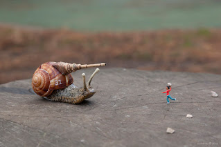
Play Fighting 1 - blog.jpg


Completed works by me:

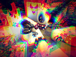
"Gambled"                                                                 "Vertigo?"

"Shoulders of Giants"


On the contrary of Slinkachu's work, from what I view from what I have completed is very different. Though indeed I used figurines and other normal objects I feel a sense of unfamiliarity. Suggestively and clearly this cannot be presented to in the outdoors in opposite to the works by Slinkachu. It also differs into that mundane feeling into the colours and tones that the pictures have been presented at. I have been quite fond of peculiar scenery as well as unusual artworks, books and items as well. I have been inspired so by these, including Alice in Wonderland. I have also taken inspiration for how and where I grew up. Where chess was played on the streets, card games during the wake of a dead. I see eggs in my imagination and mind a lot which is why I form such egg-like monstrosities, which have also been inspired by Humpty dumpty in a way.

"Gambled" was set to confuse the viewer, much like the two as well. But I wanted t to awe them as well with the seemingly anti-gravitational position of the board. In this, the egg-like creatures are to present our senses. In this particular even senses when playing a game that includes gambling, such as gambling a move in chess without much assurance. Though the creatures act like doubts and urge too. With what we want we tend to doubt; into which when we are overwhelmed we tend to lose our focus on what is important.

"Vertigo?"

This shot is very different from the others that I have taken into which it brings upon an entire mess. The other 2 with it does have mess though not as severe as this. It plays into our needs for stimulation. I have noticed, seen and experienced boredom, all of us have at some point. As it does we are driven into doing things that we have not done before. Boredom is extreme torture, that even pain would be preferred instead. With that in mind, I have created this work for the purpose of pain, the over-stimulating subjects elude from boredom but at a cost. Critically shall we think about our choices, what should we exchange for what we want, what is the cost?

"Shoulders of Giants"

This is the only shot in which "people" are present at. Among the seemingly gigantic pieces be that the chess pieces and the egg-like pieces; along the board people are on.  Whilst the pieces are designated at a singular square the people roam. They stand as being liberated. Problems tend to stay in your mind, just hanging, waiting to be faced. With such individuals as seen from the photos, they not only face their trials but seem to reside with them. When faced with a problem, people usually adjust and move around such but much like making a move in chess, it cannot be avoided. At some point, a move is to be made, shouldn't we not delay it? In by doing so, we move forward, in by doing so then we are closer in making a "checkmate".


Thursday, September 24, 2020

Art 2: Emulation Matrix - Photo shoot

Similar to the other project that included the photo montage. What is to be done is this task is to analyse what we have made. In this case, it is a photo that we have shot with some figures. This type of artwork is a method that DavidLevinthal has used, by which we take him as our inspiration and look at using the method that he has used in his works. After the image has been taken I have analysed the photo as such. 


What is seen in the photograph are seven figures that filled most of the image almost completely. As well as a light that shines through under the figures. This shot was a result of around 4 previous shots that reveal the unwanted subject matter. However, in this particular piece, it does not include any subject matter that is not wanted. The photograph is in black and white; but, the image does have a tone of blue. The figures are the ones that take up the most space in the image.  The direction of the light is behind the figures, towards the viewer.


The method in doing so is to make the subject almost pop out and seem imposing in a way. The camera shot that was used in this image was of a full shot, the image includes the full body if the figures, it also includes a dutch tilt. Also, this shot includes a low angle to again almost make the subject look overpowering.


How the figures were set horizontally one can view it that could lead from one side to the other. With also how the figures are standing, from the light could lead onto the tip of the barrel. Focal points--first that is noticed are the figures, the middles especially because of the light that passes through the legs.


Symmetry is used quite noticeably in this image as with how the figures are put in a pattern of light and dark throughout the image. The image is quite flat, aside from the factor that is the light that makes figures more 3 dimensional. Though with the dark background it can be seen as a deep space within the image. It felt somehow dominating. It gives off like a “cool” vibe, it looks realistic in a way as “mistakes” have been put intentionally. Because the figures are not lines up too perfectly, it gives realism. Though somehow, with all of the dominating aspects it also gives a comedic effect.


Friday, September 11, 2020

Composition: Thumbnail Sketch

For another task in Art, we look at composition of pictures in which we are to analyse the elements in the image. First we discuss the many types of subjects, different categories that a photo could have. We look at the focal point, what is the focus of the photo? Along with the discussion and the explanation we are shown a picture that relates into the text that is given. Thereafter we further look at different other texts that (some) will be later used in the making and completion of the task. After some time, we are then to launch into our task. The task that is given is to pick, choose a photo that is liked by you and make a sketch of it. Through it you would need to again, analyse it. We are given four of the topics that were explained to us previously. Which are, ‘Focal Point, ‘Leading Lines’, ‘Symmetry/Asymmetry’ and ‘Rule of Thirds’.  

 I have analysed it as such. The picture has its focal point at the end of the river, another element worth to mention is the moon that is shown in the picture. They are the focus of the picture, the most prominent in the photo. The leading lines that are seen is the edge of the river that leads to the end which then ends onto the moon. It has a sort of symmetry around the middle, there can be seen a separation which leads onto the left side being darker while the right are being lighter. Finally the Rule of Thirds, the picture has been separated into 9 even square-like shapes. It is said with it, in photos the focus of it should be in the intersection that are seen in the middle. Though, the photo that I have aquired do not possess the rule of thirds as seen by the implementation of the lines in the sketch.

Friday, September 4, 2020

Art: Montage

In my options, subject options, I have chosen art as one of my subjects. For this term, we have begun to focus on works of arts that are related to photomontages. Specifically those of the works of Hannah Hoch's. A photo montage is similar to a photo collage and to a modern technique popularly called photoshop.  It is the arrangement of photos in a way that conveys an idea by putting them in certain ways. At times the outcome of the finished montage does not at all look like the photos in which we have started with. As we have learned, we have also been tasked with making our own photomontages. For this first, we needed to make pages around 8-9 in where we can put pictures that we would like to put in our actual collage. We needed to use photos that were labelled for reuse and have edited and contorted them in ways that we desired to make 3 collages. 

The subject is not just 1 object, it is a multiple of mixtures. I want the eye of the viewer to search around with their eyes. Mostly though the topic of this collage is Japanese tradition. They are all intertwined through each still provides a piece, much like a jigsaw puzzle. Looking at the mythology of Japan, I use photos that will contribute to the picture. All of the fragments are of Japanese source, however, each does not bore the eye with such collage. It is a tribute to a Japanese art form, Kabuki, it is a stage play much like a “theatre”. The imaginative and beautiful clothing, style that they put in. 


The scale of the pictures that are used in the collage is varied. There are some parts that I have emphasized through, enlargement and teh change in contrast and colour. The collage possesses a mixture of colour, varying from black and white, colour as well as sepia. Even as if there is a mixture of colour that has been used, it still somehow produces a vintage feeling montage. Sepia and colour, quite blend together; there are elements which blurs the edges. Having a warm coloured background, with a sepia subject creates an “earthy” texture. Types of art that I have included, are as such, drawings, portraits, paintings, landscapes and real pictures. Some of the landscape and the drawings have been created as a background to further confuse the eyes.

The fragments are layered, though it could still somewhat be perceived as a flat imagery. I do not have repeating parts. All of the added fragments are all different. There is not a “most” important part, though they vary in size they all contribute quite equal to the picture. For this particular piece, I have used a function that added shadows, yet it isn’t too visible. I have used layering and overlapping, with like a theatre performance set.

I want the viewers to wander their eyes around the picture. Puzzled at the fragments and the many colours of this montage. There is no meaning as such in the montage, but having combined the pieces in such a way, creates a mood of abundance where the viewer can’t focus on a singular point. There is such values in the montage but one of what I think I would interpret it; within my art learn to focus on one part. Within the many “distractions”--the many fragments--you should focus on what you want. I have thought of a meaning which is contradicting what I have said in the previous, which is focusing on a singular subject. For this, I have also found that it could also be interpreted as there are many things that are around, try all the different pieces and see all the many different views and outlook that can be seen.

For my art, personally, I do not want a set meaning, for me, there is to be not a singular meaning into my art. Though I have taken inspiration and likeness into Japanese art and theatre; also have conveyed a certain feeling through the colour. I want the viewer to make their own meanings, what can you see from the art that I have created? I want those who view my art to-- as if I want them to make their own collage within my collage.  Connecting, piecing and putting together fragments of the montage and making a new story each time it is viewed. Looking at it in each time with a new perspective.


Tuesday, September 1, 2020

Art: Montage

For the past few lessons of art, we have focused on "Montages", specifically some of Hannah Hoch's works.  A montage is an act of editing, selecting, altering and putting together pieces of images to form a whole image. It was at 1915 that the form of photomontage was invented; used by the "Dadaist" a movement to a negative reaction towards WW1 at the time. Thereafter the method was used by the now-famous artists such as Hannah Hoch, creating a whole wide range of feelings through combining vast ideas. A similar method is widely used in this era, one that is probably familiar to most people. Photoshopping uses the same principle as a photomontage adding many different images that could result in a completely different look before the editing has started.  Hannah Hoch began to experiment with photomontage in the year of 1918. She has worked for Ullstein Verlag; designing knitting as well as embroidery patterns that were inspired by her photomontage work of the time. She sustained her work with photomontages for almost the rest of her life, even after she broke from the Berlin Dadaists.

Hannah Hoch | Confetta | Flickr

Friday, July 24, 2020

Photo Research: Art

For the second semester, I have chosen art as one of my choices for my subjects. In art, we are beginning to learn more about photography; the many different types and method in which a photo can be taken. For our task, we are to research about the methods that were given us and provide an insight and an almost summary of the method.  One of the first methods that I began to look at was Photogenic Drawing.
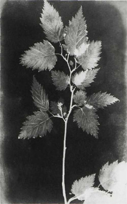
Also called a Salt Print, is a method in which required a prolonged exposure time in a camera so that a photogenic negative is produced. Which then after a negative has been created it can be used to create positive photogenic prints. A sheet of writing paper is washed with salt and dried; the other side is then sanitized with silver nitrate on one side. The sanitized side is then placed with direct contact to the negative glass printing frame. Then exposed, glass side up to sunlight up until the desired density of the print.

This was invented by William Henry Fox Talbot.